Exercises
Targeted exercises
Understanding how computers represent images
Exercise 0
Create an array of 1s and 0s where the arrangement represents a picture of a frog.
import numpy as np

# Define the 1s and 0s frog array
frog_array = np.array([
    [0,0,1,1,0,0,0,0,1,1,0,0],
    [0,1,1,1,1,0,0,1,1,1,1,0],
    [1,1,0,1,1,1,1,1,1,0,1,1],
    [1,1,1,1,1,1,1,1,1,1,1,1],
    [0,1,1,1,1,1,1,1,1,1,1,0],
    [0,0,1,1,1,1,1,1,1,1,0,0],
    [0,0,0,1,1,1,1,1,1,0,0,0],
    [0,0,1,1,1,1,1,1,1,1,0,0],
    [0,1,1,0,1,1,1,1,0,1,1,0],
    [1,1,0,0,1,1,1,1,0,0,1,1]
])
As a bonus, you could figure out how to plot this, to verify it looks like a frog!
Importing and manipulating images using the Pillow library
Exercise 1
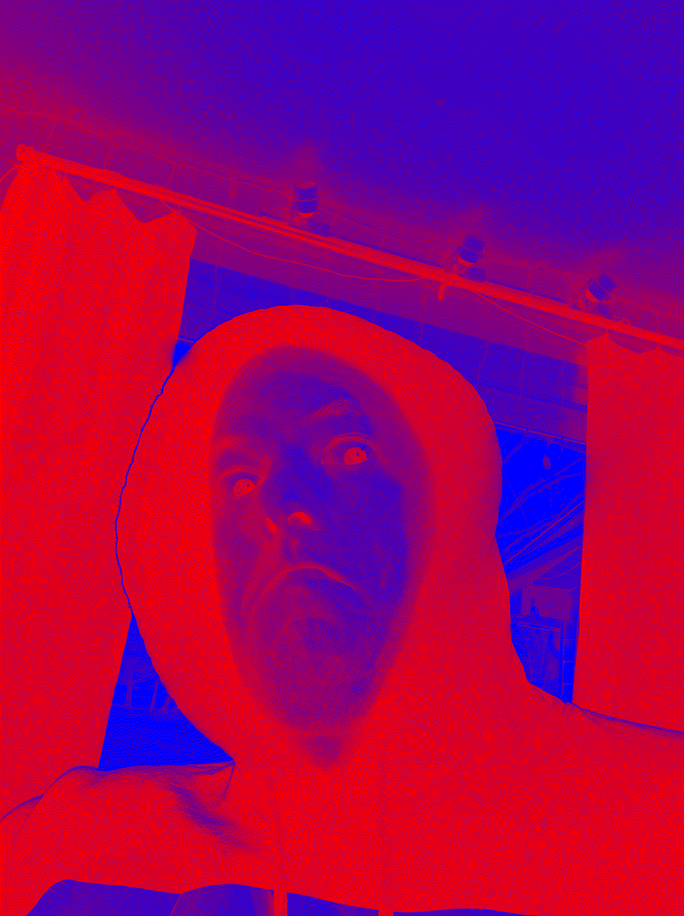
Take a selfie.
- Turn the selfie into black and white.
- Color all black parts red, and all white parts blue.
from PIL import Image

# Load image
img = Image.open("/mnt/data/image.png")

# Convert to black and white
bw_img = img.convert("1")  # "1" mode is black and white (1-bit)

# Create a new image with RGB channels
colored_img = Image.new("RGB", bw_img.size)

# Map: black -> red, white -> blue
for x in range(bw_img.width):
    for y in range(bw_img.height):
        pixel = bw_img.getpixel((x, y))
        if pixel == 0:  # black
            colored_img.putpixel((x, y), (255, 0, 0))  # red
        else:  # white
            colored_img.putpixel((x, y), (0, 0, 255))  # blue

colored_img.save("/mnt/data/selfie_red_black_blue.png")
colored_img.show()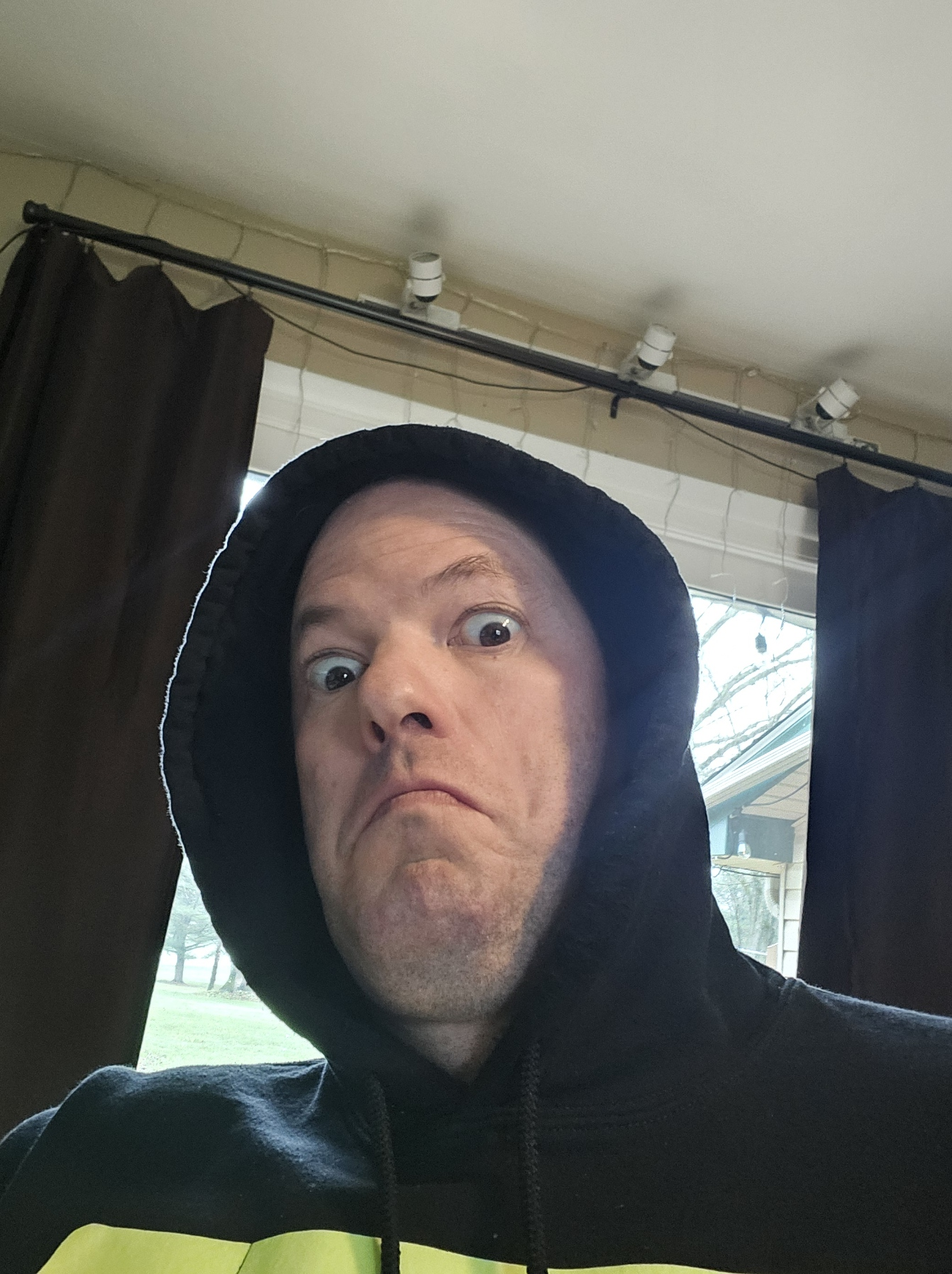
Exercise 1
Using Pillow, combined with Numpy arrays, create a png image that is a smiley face.
import numpy as np
from PIL import Image

# The binary smiley face array
smiley_array = np.array([
    [1,1,1,1,1,1,0,0,0,0,1,1,1,1,1,1],
    [1,1,1,1,0,0,1,1,1,1,0,0,1,1,1,1],
    [1,1,1,0,1,1,1,1,1,1,1,1,0,1,1,1],
    [1,1,0,1,1,1,1,1,1,1,1,1,1,0,1,1],
    [1,0,1,1,1,1,1,1,1,1,1,1,1,1,0,1],
    [1,0,1,1,0,0,1,1,1,1,0,0,1,1,0,1],
    [0,1,1,1,0,0,1,1,1,1,0,0,1,1,1,0],
    [0,1,1,1,1,1,1,1,1,1,1,1,1,1,1,0],
    [0,1,1,1,1,1,1,1,1,1,1,1,1,1,1,0],
    [0,1,1,1,1,1,1,1,1,1,1,1,1,1,1,0],
    [1,0,1,1,0,1,1,1,1,1,1,0,1,1,0,1],
    [1,0,1,1,1,0,1,1,1,1,0,1,1,1,0,1],
    [1,1,0,1,1,1,0,0,0,0,1,1,1,0,1,1],
    [1,1,1,0,1,1,1,1,1,1,1,1,0,1,1,1],
    [1,1,1,1,0,0,1,1,1,1,0,0,1,1,1,1],
    [1,1,1,1,1,1,0,0,0,0,1,1,1,1,1,1]
], dtype=np.uint8)

# Scale up the array for visibility
scale = 16
smiley_scaled = np.kron(smiley_array, np.ones((scale, scale), dtype=np.uint8)) * 255  # Scale to 255 for image

# Convert to RGB: white background, black for 1s
rgb_image = np.stack([smiley_scaled]*3, axis=-1)
rgb_image[smiley_scaled == 0] = [255, 255, 255]  # white for background
rgb_image[smiley_scaled == 255] = [0, 0, 0]      # black for face

# Create and save image
smiley_img = Image.fromarray(rgb_image.astype(np.uint8))
smiley_img.show()
Exercise 1
Take a selfie and crop out your body, much like you would do to create a headshot.
import numpy as np
from PIL import Image
from codechembook.quickTools import quickOpenFilename, quickPopupMessage

quickPopupMessage(message = 'Select Selfie.')
original_selfie = Image.open(quickOpenFilename(filetypes = '*.png'))

headshot = original_selfie.crop([
                             400,           # left
                             200,            # top
                             1000,     # right
                             900])   # bottom

 # Show final combined and cropped image
headshot.show()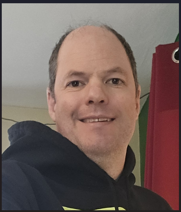
Comprehensive exercises
Exercise 1
One of the old lab members in your group made a .png figure of some spectra. You want to include this image in an analysis of your current data, and want to preserve the color scheme you are using in your publication. You don’t have access to their data anymore. Write a script that will go through any such images, and replace one color with another one. You can test with the file ‘old-spectra.png’ found on the companion website (\website).
import numpy as np
from PIL import Image

# Open the thermal image and convert it to a 2d array
old_image = Image.open("C:/Users/benle/Documents/GitHub/CCB-HUGO/hugosite/content/Data/Old_figure.png").convert("RGB")
old_image_data = np.array(old_image)

 # Make a new 2d array of zeros to hold the recolored image
new_image_data = np.zeros_like(old_image_data)

# Determine the shape of the image in pixels x pixels
width, height = old_image_data.shape[0:2]

# Loop over pixels and set color of new one based on luminosity of thermal
for i in range(width):
    for j in range(height):
        if (85 < old_image_data[i][j][0]  < 170) and (150 < old_image_data[i][j][1]  < 230) and (205 < old_image_data[i][j][2]  < 255):
        #if tuple(old_image_data[i][j]) == (91, 155, 213):
            new_image_data[i][j] = [255, 0, 0]
        else:
            new_image_data[i][j] = old_image_data[i][j]

#%
# Convert new data to image
new_image = Image.fromarray(new_image_data.astype('uint8'))
new_image.show()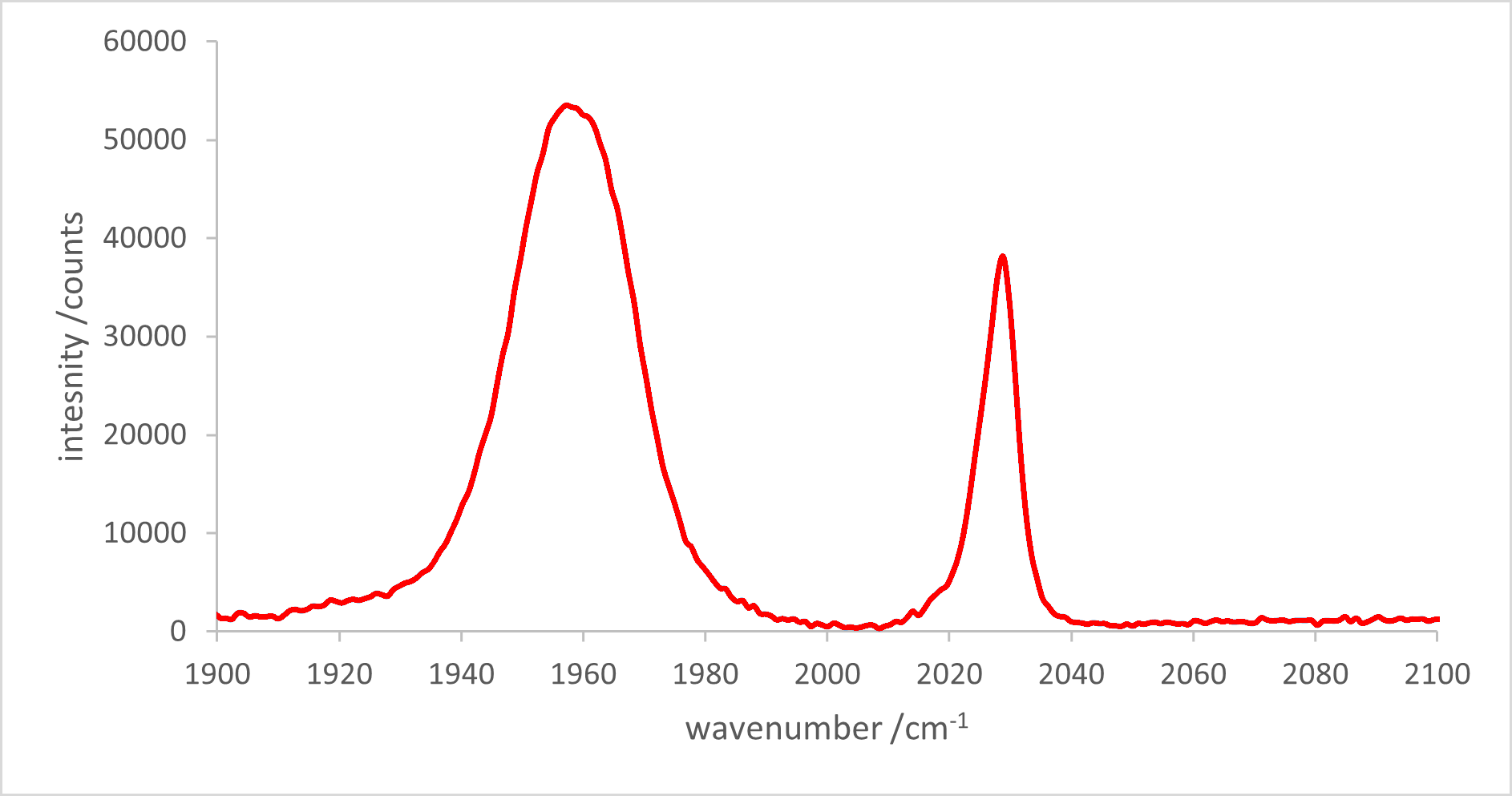
Exercise 1
You also think it could be good to extract the values from the old spectra discussed in the previous exercise. You are lucky that the extremes of the $x$ and $y$ axes are labeled, so that you can simply crop the image to contain only the plot area and know the data values of the edges. This would let you re-plot this in any Plotly figure you want. Write a code that will crop this image, and then extract locations of the data and assign them the correct values. Save the extracted values to a .csv or excel workbook. Then plot the resulting data in Plotly. Comment on how well this worked for extracting the data. Does the plot look similar?
import numpy as np
from PIL import Image

# Open the thermal image and convert it to a 2d array
old_image = Image.open("C:/Users/benle/Documents/GitHub/CCB-HUGO/hugosite/content/Data/Old_figure.png").convert("RGB")
old_image_data = np.array(old_image)

 # Make a new 2d array of zeros to hold the recolored image
new_image_data = np.zeros_like(old_image_data)

cropped_image = old_image.crop([0.27 * width,           # left
                             0.03*height,            # top
                             1.572*width,     # right
                             0.478*height])   # bottom

cropped_width, cropped_height = np.array(cropped_image).shape[:2]

x, y = [], []
for i in range(cropped_width):
    for j in range(cropped_height):
        if tuple(old_image_data[i][j]) == (91, 155, 213):
            x.append(j)
            y.append(i)

x_data = np.array(x)
x_data = x_data - np.min(x_data)
x_data = x_data/np.max(x_data)
x_data = x_data * 200 + 1900

y_data = -1*np.array(y) # because pixels start from teh top, but y-axis starts from bottom
y_data = y_data - np.min(y_data)
y_data = y_data/np.max(y_data)
y_data = y_data * 60000 + 0

from codechembook.quickPlots import quickScatter
quickScatter(x_data, y_data, mode = "markers")

with open("captured_data.csv", "w") as d:
    d.write("x, y \n")
    for x, y in zip(x_data,y_data):
        d.write(f"{x}, {y}")
        d.write("\n")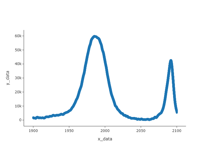
This plot does look similar, ohowever, it will only look similar if “markers” are used. If you use “lines” then you will not see this pattern. That is because the data was generated by rastering across the image. If you want to use lines, then you need to sort the x and y values by x first. Also, consider the fact that the lines in the original data are broad, and so the data you extract is very likely to have more data points than the original data. Thus, this should not be seen as a way to capture the original data, but a means by which to capture the data required to make a plot that looks similar to the original plot.