Exercises
Targeted exercises
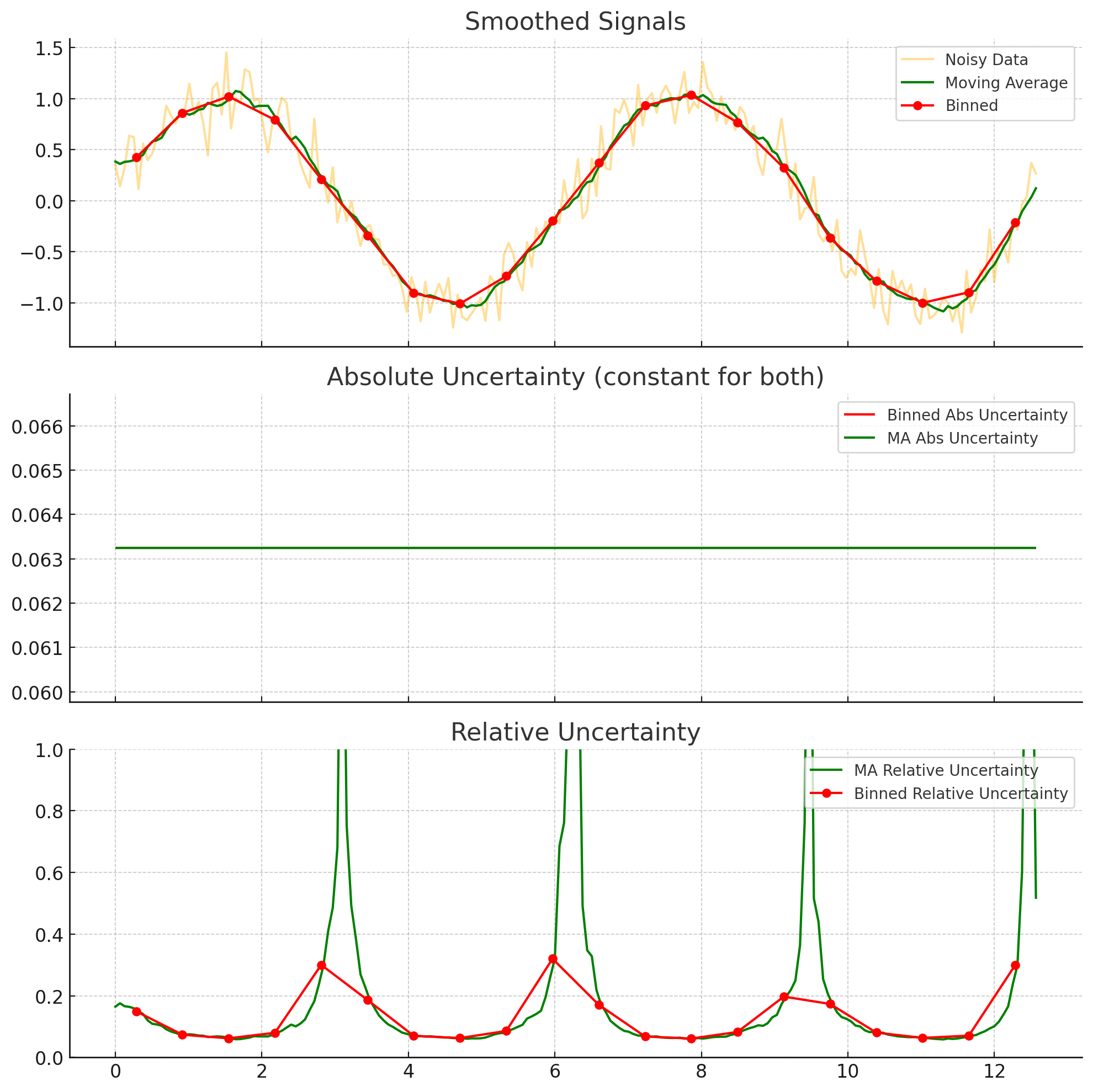
Comparing smoothing approaches
Exercise 0
Imagine you have data with uncertainties for the dependent variables. You are considering smoothing using either binning or moving averages. The bin width and the moving average window would be the same size. After smoothing, which approach results in the largest absolute uncertainty? Which approach results in the largest relative uncertainties? You can, of course, use code to answer this question, if you want.
The absolute uncertainty is given by $\sigma_{smoothed} = \frac{\sigma_{data}}{\sqrt(N)}$. Since both methods will have the same windows size, they should have the same $N$ (assuming a constant spacing on the independent variable). Thus, we expect the absolute uncertainty to remain the same, between the two. However, the relative uncertainty divides the $\sigma_{smoothed}$ by the average of the data, which can be different for the moving window. IN particular, it can be smaller, making the relative uncertainty larger. This is illustrated below for a noisy sin wave.
Generating noisy test data using random numbers from numpy.random
Exercise 1
We are going to explore what ‘random’ means to a computer. Use the following code, which generates two arrays using a Numpy random number generator and then subtracts one from another:
import numpy as np
rng1 = np.random.default_rng(42) # sets a 'seed' for random number generation
rand1 = rng1.random(10) # get 10 random numbers from the generator`
rng2 = np.random.default_rng(42) # set up random number generation with the same seed as above`
rand2 = rng2.random(10) # get another 10 random numbers, using the second generator`
rand1 - rand2
.
- What does it mean that
rand1 - rand2gave an array of all zeros? - Now, repeat the above, but change the value given to
default_rng(), the \textit{second} time you use it. - What does it mean that
rand1 - rand2did not give an array of all zeros? - Repeat the calculation again, just as above. Do you get the same difference as before?
- What does all of this tell you about random number generation in Numpy?
The first time you run the code, you get an array of all zeros, because the ‘random numbers’ are not really random. They are calculated, using a seed (which, if not specified, is ‘randomly’ chosen). Thus, in the next two times, when you do not specify the seed for the rng2, you get a different set of random numbers each time. This tells you that the ‘random number’ in Python are not really random, but are random ’enough’ for many of our use cases. The use of a seed can be quite nice, when you want to generate ‘random’ numbers that will be repeatable by someone else.
Exercise 2
Perform a linear fit to a series of ten random normally-distributed $y$-values (a mean of 0 and a standard deviation of 1) over a range of $x$-values from 0 to 10. Do ten trials and compute the standard error of the slopes, and compare that to the uncertainties of the slopes in each individual fit. The expected slope is 0.
import numpy as np
from plotly.subplots import make_subplots
import plotly.graph_objects as go
# Simulation parameters
n_points = 10
n_trials = 10
x = np.linspace(0, 10, n_points)
slopes = []
slope_uncertainties = []
# Perform trials
for _ in range(n_trials):
y = np.random.normal(0, 1, size=n_points)
A = np.vstack([x, np.ones_like(x)]).T
coeffs, residuals, rank, s = np.linalg.lstsq(A, y, rcond=None)
slope = coeffs[0]
y_fit = A @ coeffs
# Estimate variance of residuals
dof = n_points - 2
residual_var = np.sum((y - y_fit) ** 2) / dof
# Covariance matrix of the fit parameters
cov = residual_var * np.linalg.inv(A.T @ A)
slope_std = np.sqrt(cov[0, 0])
slopes.append(slope)
slope_uncertainties.append(slope_std)
# Compute standard error of the slopes from the distribution
mean_of_slopes = np.mean(slopes)
standard_error_of_slopes = np.std(slopes, ddof=1)
# Prepare the plot
fig = make_subplots(rows=1, cols=1, subplot_titles=["Slopes and their Uncertainties"])
fig.add_scatter(
x=np.arange(n_trials),
y=slopes,
error_y=dict(type="data", array=slope_uncertainties, visible=True),
mode="markers",
name="Slope with uncertainty",
row=1,
col=1
)
fig.add_scatter(
x=[-1, n_trials],
y=[np.mean(slopes)] * 2,
mode="lines",
name="Mean slope",
line=dict(dash="dash"),
row=1,
col=1
)
fig.update_layout(
template = "simple_white",
title_text=f"Slopes from Linear Fits (mean = {mean_of_slopes:.3f}, Std. Error = {standard_error_of_slopes:.3f})",
xaxis_title="Trial",
yaxis_title="Slope"
)
# Show or export the figure as needed
fig.show("png")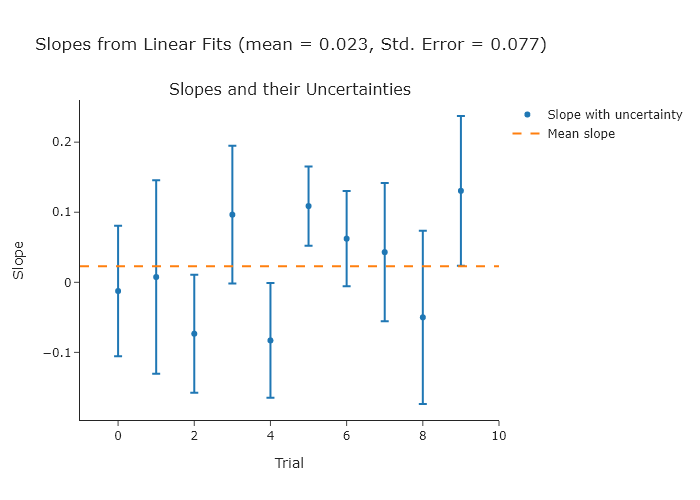 NOTE: since you are using random values, your plot will look different.
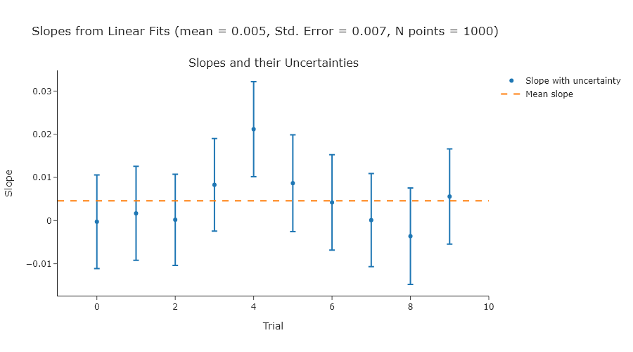
Exercise 2
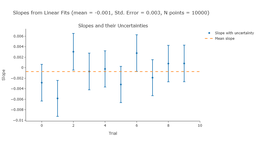
Repeat Exercise 2 using 100, 1000, and 10000 points.
import numpy as np
from plotly.subplots import make_subplots
import plotly.graph_objects as go

# Simulation parameters
n_points_list = [100, 1000, 10000]
n_trials = 10


for n_points in n_points_list:
    x = np.linspace(0, 10, n_points)
    slopes = []
    slope_uncertainties = []

    # Perform trials
    for _ in range(n_trials):
        y = np.random.normal(0, 1, size=n_points)
        A = np.vstack([x, np.ones_like(x)]).T
        coeffs, residuals, rank, s = np.linalg.lstsq(A, y, rcond=None)
        slope = coeffs[0]
        y_fit = A @ coeffs

        # Estimate variance of residuals
        dof = n_points - 2
        residual_var = np.sum((y - y_fit) ** 2) / dof

        # Covariance matrix of the fit parameters
        cov = residual_var * np.linalg.inv(A.T @ A)
        slope_std = np.sqrt(cov[0, 0])

        slopes.append(slope)
        slope_uncertainties.append(slope_std)

    # Compute standard error of the slopes from the distribution
    mean_of_slopes = np.mean(slopes)
    standard_error_of_slopes = np.std(slopes, ddof=1)

    # Prepare the plot
    fig = make_subplots(rows=1, cols=1, subplot_titles=["Slopes and their Uncertainties"])

    fig.add_scatter(
            x=np.arange(n_trials),
            y=slopes,
            error_y=dict(type="data", array=slope_uncertainties, visible=True),
            mode="markers",
            name="Slope with uncertainty",
            row=1,
            col=1
            )

    fig.add_scatter(
            x=[-1, n_trials],
            y=[np.mean(slopes)] * 2,
            mode="lines",
            name="Mean slope",
            line=dict(dash="dash"),
            row=1,
            col=1
            )

    fig.update_layout(
        template = "simple_white",
        title_text=f"Slopes from Linear Fits (mean = {mean_of_slopes:.3f}, Std. Error = {standard_error_of_slopes:.3f}, N points = {n_points})",
        xaxis_title="Trial",
        yaxis_title="Slope",
        width = 900,
        )

    # Show or export the figure as needed
    fig.show("png")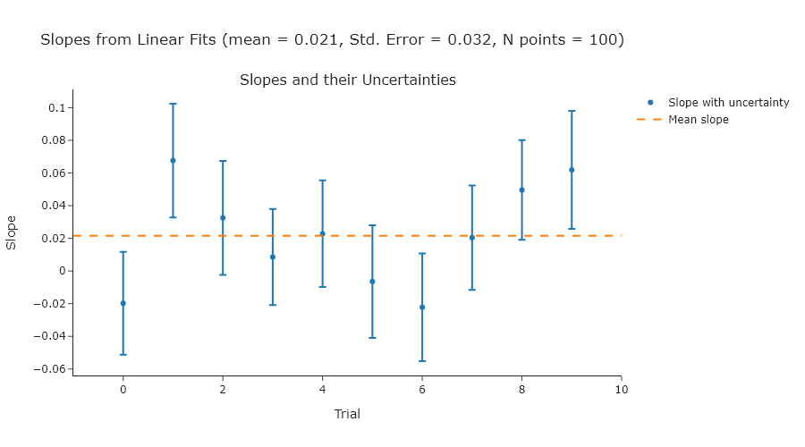
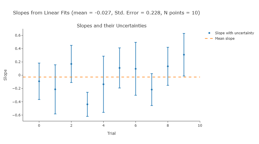
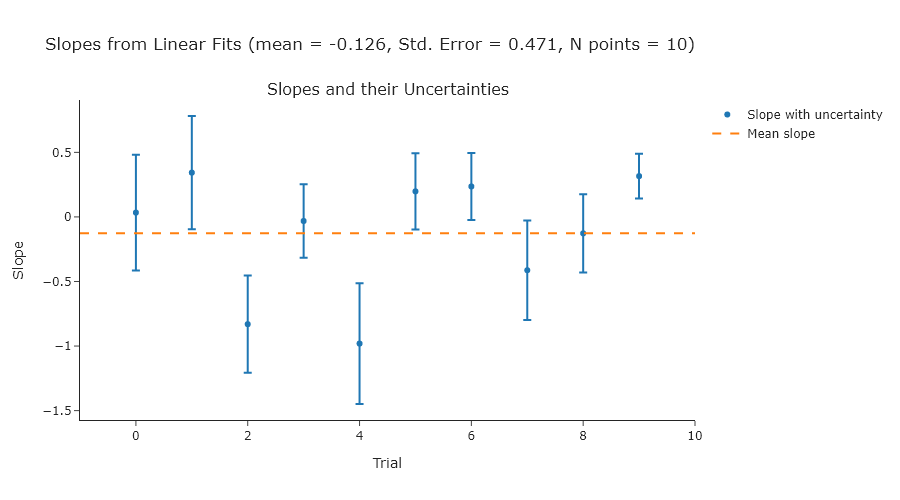
Exercise 3
Repeat Exercise 2 using standard deviations of 2, 3, and 4.
import numpy as np
from plotly.subplots import make_subplots
import plotly.graph_objects as go

# Simulation parameters
n_points = 10
n_trials = 10
std_list = [2, 3, 4]

for std in std_list:
    x = np.linspace(0, 10, n_points)
    slopes = []
    slope_uncertainties = []

    # Perform trials
    for _ in range(n_trials):
        y = np.random.normal(0, std, size=n_points)
        A = np.vstack([x, np.ones_like(x)]).T
        coeffs, residuals, rank, s = np.linalg.lstsq(A, y, rcond=None)
        slope = coeffs[0]
        y_fit = A @ coeffs

        # Estimate variance of residuals
        dof = n_points - 2
        residual_var = np.sum((y - y_fit) ** 2) / dof

        # Covariance matrix of the fit parameters
        cov = residual_var * np.linalg.inv(A.T @ A)
        slope_std = np.sqrt(cov[0, 0])

        slopes.append(slope)
        slope_uncertainties.append(slope_std)

    # Compute standard error of the slopes from the distribution
    mean_of_slopes = np.mean(slopes)
    standard_error_of_slopes = np.std(slopes, ddof=1)

    # Prepare the plot
    fig = make_subplots(rows=1, cols=1, subplot_titles=["Slopes and their Uncertainties"])

    fig.add_scatter(
            x=np.arange(n_trials),
            y=slopes,
            error_y=dict(type="data", array=slope_uncertainties, visible=True),
            mode="markers",
            name="Slope with uncertainty",
            row=1,
            col=1
            )

    fig.add_scatter(
            x=[-1, n_trials],
            y=[np.mean(slopes)] * 2,
            mode="lines",
            name="Mean slope",
            line=dict(dash="dash"),
            row=1,
            col=1
            )

    fig.update_layout(
        template = "simple_white",
        title_text=f"Slopes from Linear Fits (mean = {mean_of_slopes:.3f}, Std. Error = {standard_error_of_slopes:.3f}, N points = {n_points})",
        xaxis_title="Trial",
        yaxis_title="Slope",
        width = 900,
        )

    # Show or export the figure as needed
    fig.show("png")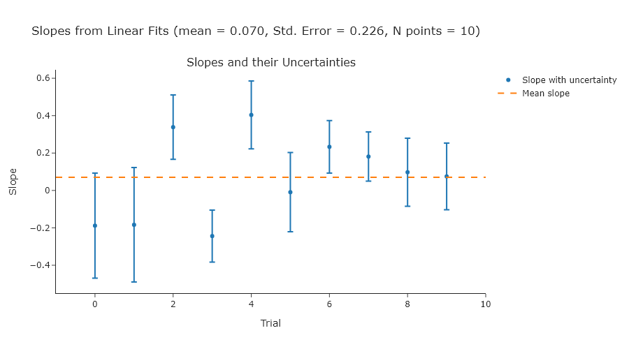
Exercise 4
Reproduce Figure 10.2 using your own code.
import numpy as np
from scipy.stats import norm
from plotly.subplots import make_subplots

# Generate data
np.random.seed(0)
data = np.random.normal(0, 1, size=10000)

# Parameters
bin_widths = [0.02, 0.08, 0.32]
x_range = (-4, 4)

# Create subplots
fig = make_subplots(rows=1, cols=3, subplot_titles=[f"width = {w}" for w in bin_widths])

for i, width in enumerate(bin_widths):
    # Histogram
    bins = np.arange(x_range[0], x_range[1] + width, width)
    hist_counts, bin_edges = np.histogram(data, bins=bins)
    bin_centers = 0.5 * (bin_edges[:-1] + bin_edges[1:])

    # Normal curve scaled
    x_vals = np.linspace(x_range[0], x_range[1], 500)
    scale = len(data) * width
    normal_curve = norm.pdf(x_vals, 0, 1) * scale

    # Add histogram
    fig.add_bar(
        x=bin_centers,
        y=hist_counts,
        marker_color='gray',
        showlegend=False,
        row=1,
        col=i + 1
    )

    # Add normal curve
    fig.add_scatter(
        x=x_vals,
        y=normal_curve,
        mode='lines',
        line=dict(dash='dash', color='black'),
        showlegend=False,
        row=1,
        col=i + 1
    )

# Final layout
fig.update_layout(
    height=300,
    width=1000,
    title_text="Histograms with Different Bin Widths"
)
fig.update_xaxes(range=x_range)

fig.show("png")  # Uncomment if you're running locally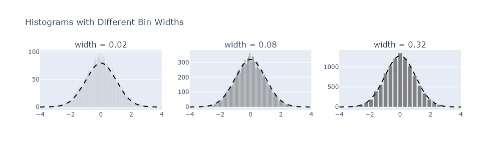
Exercise 5
There are some general guidelines for understanding how large to make bins. One common one is the Friedman-Diaconis rule, but there are others, such as Sturges’s formula or the Rice rule. Modify your code from Exercise 4 to plot the results from each of these formulas.
import numpy as np
from scipy.stats import norm
from plotly.subplots import make_subplots

# Generate normal data
np.random.seed(0)
data = np.random.normal(0, 1, size=10000)

# Plot range
x_range = (-4, 4)

# Binning rules
def fd_rule(data):
    iqr = np.subtract(*np.percentile(data, [75, 25]))
    return 2 * iqr / (len(data) ** (1/3))

def sturges_rule(data):
    k = np.ceil(np.log2(len(data)) + 1)
    return (x_range[1] - x_range[0]) / k

def rice_rule(data):
    k = np.ceil(2 * len(data) ** (1/3))
    return (x_range[1] - x_range[0]) / k

rules = {
    "Friedman-Diaconis": fd_rule,
    "Sturges": sturges_rule,
    "Rice": rice_rule
}

# Create 1-row, 3-column plot
fig = make_subplots(
    rows=1, cols=3,
    subplot_titles=[f"{name} width = {rule(data):.2f}" for name, rule in rules.items()]
)

# Add histogram and normal overlay for each rule
for i, (name, rule_func) in enumerate(rules.items(), start=1):
    width = rule_func(data)
    bins = np.arange(x_range[0], x_range[1] + width, width)
    hist_counts, bin_edges = np.histogram(data, bins=bins)
    bin_centers = 0.5 * (bin_edges[:-1] + bin_edges[1:])

    x_vals = np.linspace(x_range[0], x_range[1], 500)
    scale = len(data) * width
    normal_y = norm.pdf(x_vals, 0, 1) * scale

    # Add histogram
    fig.add_bar(
        x=bin_centers,
        y=hist_counts,
        marker_color='gray',
        showlegend=False,
        row=1,
        col=i
    )

    # Add dashed normal curve
    fig.add_scatter(
        x=x_vals,
        y=normal_y,
        mode='lines',
        line=dict(dash='dash', color='black'),
        showlegend=False,
        row=1,
        col=i
    )

# Layout
fig.update_layout(
    height=300,
    width=1000,
    title_text="Histograms with Bin Widths from Different Rules"
)
fig.update_xaxes(range=x_range)

fig.show("png")  # Uncomment this to view the plot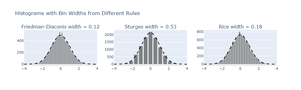
Smoothing by moving averages using scipy.signal.convolve
Exercise 6
A common bandshape to encounter in vibrational spectroscopy of condensed phases is a Voight profile. This profile is a convolution of a Gaussian and Lorentzian profiles, and can be generated using the scipy.signal.convolve() function. However, many times people use pseudo-Voight profiles instead, which are the sum of Gaussian and Lorentzian profiles. The LMFIT module has some documentation of this, but it is also well described on Wikipedia. In this problem, generate a Voight and ’equivalent’ pseudo-Voight profile. Plot them against one another. Describe the differences you notice.
import numpy as np
from scipy.signal import convolve
from plotly.subplots import make_subplots

# x range and spacing
x = np.linspace(-10, 10, 1000)
dx = x[1] - x[0]

# Gaussian and Lorentzian widths
sigma = 1.0
gamma = 1.0

# Define Gaussian and Lorentzian
def gaussian(x, sigma):
    return np.exp(-x**2 / (2 * sigma**2)) / (sigma * np.sqrt(2 * np.pi))

def lorentzian(x, gamma):
    return gamma / (np.pi * (x**2 + gamma**2))

# Voigt profile: convolution
g = gaussian(x, sigma)
l = lorentzian(x, gamma)
voigt = convolve(g, l, mode='same') * dx  # dx normalization

# Estimate FWHM of Voigt profile (Olivero & Longbothum)
fwhm_voigt = 0.5346 * (2 * gamma) + np.sqrt(
    0.2166 * (2 * gamma) ** 2 + (2 * sigma * np.sqrt(2 * np.log(2))) ** 2
)

# Pseudo-Voigt mixing parameter (eta)
eta = (
    1.36603 * (gamma / fwhm_voigt)
    - 0.47719 * (gamma / fwhm_voigt) ** 2
    + 0.11116 * (gamma / fwhm_voigt) ** 3
)

# Convert FWHM to shape parameters
sigma_pv = fwhm_voigt / (2 * np.sqrt(2 * np.log(2)))  # Gaussian part
gamma_pv = fwhm_voigt / 2  # Lorentzian part

# Pseudo-Voigt: weighted sum
pseudo_voigt = eta * lorentzian(x, gamma_pv) + (1 - eta) * gaussian(x, sigma_pv)

# Normalize both profiles to max = 1
voigt /= np.max(voigt)
pseudo_voigt /= np.max(pseudo_voigt)


# Plot using Plotly
fig = make_subplots(rows=1, cols=1, subplot_titles=["Voigt vs Pseudo-Voigt (Matched FWHM)"])
fig.add_scatter(x=x, y=voigt, mode='lines', name='Voigt (convolution)', line=dict(color='black'))
fig.add_scatter(x=x, y=pseudo_voigt, mode='lines', name='Pseudo-Voigt (FWHM matched)', line=dict(dash='dash', color='red'))

fig.update_layout(
    title="Normalized Voigt and Pseudo-Voigt Profiles with Matched Widths",
    xaxis_title="x",
    yaxis_title="Intensity",
    width=800,
    height=400
)

fig.show("png")  # Uncomment to view if running locally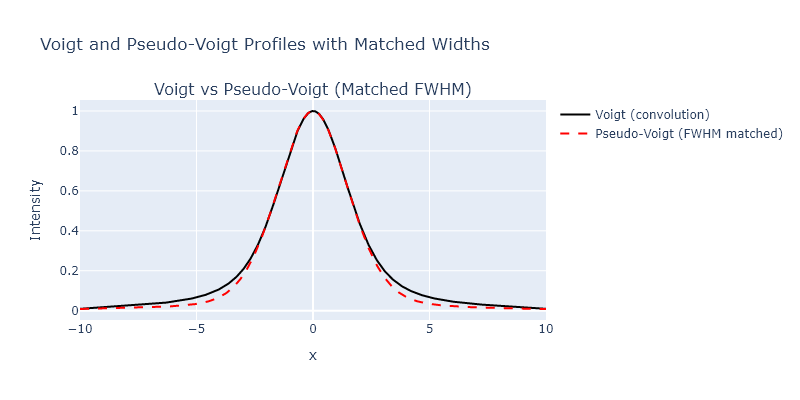
Smoothing using local regression with scipy.signal.savgol filter
Exercise 7
We explored several different smoothing approaches in this chapter, but did not directly compare them. Take the bin centers and counts from the highest bin count in Exercise 4, apply the following methods, and then plot them all on one plot:
- binning
- moving averages
- Savizky-Golay.
import numpy as np
from scipy.signal import savgol_filter
from plotly.subplots import make_subplots

# Generate normal data
np.random.seed(0)
data = np.random.normal(0, 1, size=10000)

# Define common width for all smoothing methods
bin_width = 0.32
x_range = (-4, 4)

# Histogram binning (coarse bins)
bins = np.arange(x_range[0], x_range[1] + bin_width, bin_width)
binned_counts, bin_edges = np.histogram(data, bins=bins)
bin_centers = 0.5 * (bin_edges[:-1] + bin_edges[1:])

# Create fine bins for applying smoothing
fine_bin_width = 0.02
fine_bins = np.arange(x_range[0], x_range[1] + fine_bin_width, fine_bin_width)
fine_counts, fine_edges = np.histogram(data, bins=fine_bins)
fine_centers = 0.5 * (fine_edges[:-1] + fine_edges[1:])

# Determine number of points in smoothing window from bin width
window_points = int(bin_width / fine_bin_width)
if window_points % 2 == 0:
    window_points += 1  # Ensure odd length for Savitzky-Golay

# Moving average smoothing
kernel = np.ones(window_points) / window_points
moving_avg = np.convolve(fine_counts, kernel, mode='same')

# Savitzky-Golay smoothing
savgol = savgol_filter(fine_counts, window_length=window_points, polyorder=3)

# Plot
fig = make_subplots(rows=1, cols=1, subplot_titles=[f"Smoothing with Shared Width ≈ {bin_width}"])

fig.add_scatter(x=bin_centers, y=binned_counts/max(binned_counts), mode='lines+markers', name='Binned (Width = 0.32)')
fig.add_scatter(x=fine_centers, y=moving_avg/max(moving_avg), mode='lines', name='Moving Average')
fig.add_scatter(x=fine_centers, y=savgol/max(savgol), mode='lines', name='Savitzky-Golay')

fig.update_layout(
    width=800,
    height=400,
    title_text="Comparison of Binning and Smoothing with Equivalent Widths",
    xaxis_title="x",
    yaxis_title="Count"
)

fig.show('png')  # Uncomment to view plot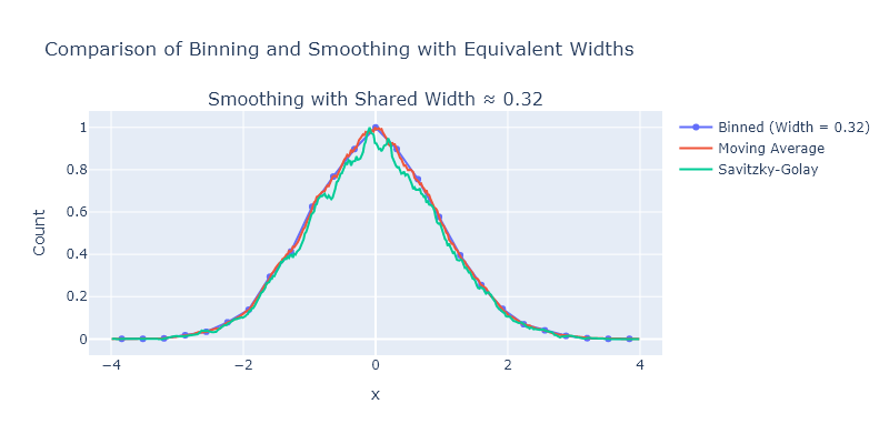
Comprehensive exercises
Exercise 1
The appearance of binned data can change drastically as the width of the bins change. Using the particle size measurement data from our website (sizes.csv), explore the effect of different bin sizes. You can vary the number of bins between the fourth-root of the number of measurements and 1/2 the number of measurements. For each choice, fit the histogram to a log-normal distribution. How much smoothing can you do before the best-fitting values change by more than their uncertainty compared using the Freedman-Diaconis rule, as introduced in Exercise 5?
import numpy as np
from lmfit.models import LognormalModel
from plotly.subplots import make_subplots

# Load and clean data
data = np.genfromtxt('C:/Users/benle/Documents/GitHub/CCB-HUGO/hugosite/content/Data/sizes.csv', delimiter=',')
data = data[not np.isnan(data)]

# Freedman-Diaconis rule
q75, q25 = np.percentile(data, [75, 25])
iqr = q75 - q25
bin_width_fd = 2 * iqr / (len(data) ** (1/3))
bins_fd = int(np.ceil((np.max(data) - np.min(data)) / bin_width_fd))

# Range of other bin counts
n_points = len(data)
min_bins = int(np.ceil(n_points ** 0.25))
max_bins = int(np.floor(n_points / 2))
bin_counts = np.unique(np.linspace(min_bins, max_bins, num=6, dtype=int))

# Store results
results = []

# Create subplot grid
n_rows = 1 + len(bin_counts)
fig = make_subplots(rows=n_rows, cols=1, subplot_titles=["Freedman-Diaconis"] + [f"{n} bins" for n in bin_counts])

# Fitting and plotting function
def fit_and_plot_histogram(bin_count, row_index, label):
    hist, edges = np.histogram(data, bins=bin_count, density=True)
    centers = 0.5 * (edges[:-1] + edges[1:])

    model = LognormalModel()
    try:
        params = model.guess(hist, x=centers)
        result = model.fit(hist, params, x=centers)

        mu = result.params['center'].value
        mu_err = result.params['center'].stderr
        if mu_err is None:
            raise RuntimeError("No uncertainty")

        results.append((label, mu, mu_err))

        fig.add_bar(x=centers, y=hist, name=f"{label} data", marker = dict(color = "grey"), row=row_index, col=1, showlegend = False)
        fig.add_scatter(x=centers, y=result.best_fit, mode='lines', name=f"{label} fit", line = dict(color = "red"), row=row_index, col=1, showlegend = False)

    except Exception as e:
        results.append((label, "Fit failed", str(e)))
        fig.add_annotation(text=f"{label}: fit failed", showarrow=False, row=row_index, col=1)

# Freedman-Diaconis fit
fit_and_plot_histogram(bins_fd, 1, "Freedman-Diaconis")

# Other bin count fits
for i, b in enumerate(bin_counts):
    fit_and_plot_histogram(b, i + 2, f"{b} bins")

# Layout
fig.update_layout(template = "simple_white", bargap = 0, height=300 * n_rows, title_text="Lognormal Fits to Binned Data")
fig.show("png")  # Uncomment to view

# Print summary
for label, mu, mu_err in results:
    print(f"{label:>20}: center = {mu} ± {mu_err}")
   Freedman-Diaconis: center = 0.6956228492401311 ± 0.013930642627992759
              4 bins: center = 0.726370048848658 ± 0.05359704925622609
             23 bins: center = 0.6873637100659797 ± 0.02600805301824619
             42 bins: center = 0.6960247040294797 ± 0.02798449504644908
             61 bins: center = 0.6928070333626083 ± 0.033756306427389346
             80 bins: center = 0.685015960119922 ± 0.03534174409669473
            100 bins: center = 0.6856864068570485 ± 0.03410711668674474
Exercise 2
Using the convolution function scipy.signal.convolve(), write a wrapper function that performs weighted moving average smoothing of the X-ray powder diffraction data provided on the website for this book. This function should take as arguments: the data to be smoothed and an array that specifies the shape of the smoothing function. For the latter, use:
- A square function.
- A parabolic function
- A triangular function
- A sine function
- A Gaussian function
- A Lorentzian function
Compare the results using Plotly and comment on which methods appear to give the best noise reduction with the minimum peak broadening.
import numpy as np
from scipy.signal import convolve
from scipy.stats import norm
from plotly.subplots import make_subplots

# Load XRD data
x, y = np.genfromtxt('C:/Users/benle/Documents/GitHub/CCB-HUGO/hugosite/content/Data/KBr.csv', delimiter=',', unpack=True)
x = x[~np.isnan(y)]
y = y[~np.isnan(y)]

# Define smoothing kernels
def get_kernel(shape='square', size=15):
    x = np.linspace(-1, 1, size)
    if shape == 'square':
        kernel = np.ones(size)
    elif shape == 'parabolic':
        kernel = 1 - x**2
    elif shape == 'triangular':
        kernel = 1 - np.abs(x)
    elif shape == 'sine':
        kernel = np.sin(np.pi * (x + 1) / 2)
    elif shape == 'gaussian':
        kernel = norm.pdf(x, 0, 0.3)
    elif shape == 'lorentzian':
        gamma = 0.3
        kernel = 1 / (1 + (x / gamma)**2)
    else:
        raise ValueError("Unknown shape")
    return kernel / np.sum(kernel)

# Wrapper smoothing function
def smooth(data, kernel_shape, size=15):
    kernel = get_kernel(kernel_shape, size=size)
    return convolve(data, kernel, mode='same')

# Apply all smoothing methods
shapes = ['square', 'parabolic', 'triangular', 'sine', 'gaussian', 'lorentzian']
smoothed = {shape: smooth(y, shape) for shape in shapes}

# Plot results using plotly
fig = make_subplots()

# Plot original
fig.add_scatter(x=x, y=y, mode='lines', name='Original')

# Plot smoothed versions
for i, shape in enumerate(shapes):
    row = (i + 1) // 2 + 1
    col = (i + 1) % 2 + 1
    fig.add_scatter(x=x, y=smoothed[shape], mode='lines', name=shape.title())

fig.update_xaxes(range=[39,43])
fig.update_layout(template = "simple_white", height=800, width=600, title_text="Comparison of Smoothing Kernels")
fig.show("png")  # Uncomment to view plot
This focuses on just a single peak, but you can adjust the range of the x-axis to se other aspects.
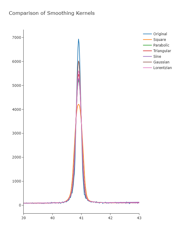 _Looking at these, it seems that the Gaussian gives the best results, which may not be surprising, given that this is approximately the underlying shape of the peaks. _
Exercise 3
Generate a Gaussian with $\sigma = 1$ and $x_0 = 0$ on an $x$-axis from -5 to 5 with 20 points. Then add noise by adding normally-distributed random numbers with a standard deviation of 0.1. Fit the a Gaussian profile to this data using lmfit, then smooth it using a simple 7-point moving average and fit it again. Compare the fit of the original data versus the fit of the smoothed data: do the best fitting parameters agree within uncertainty? Has the uncertainty changed? What do you think about fitting smoothed data, rather than original noisey data?
import numpy as np
from lmfit.models import GaussianModel
from scipy.signal import convolve
from plotly.subplots import make_subplots

# Generate synthetic Gaussian data
x = np.linspace(-5, 5, 20)
true_amp = 1
true_cen = 0
true_sigma = 1

def gaussian(x, amp, cen, sig):
    return amp * np.exp(-(x - cen)**2 / (2 * sig**2))

# Generate noisy Gaussian data
np.random.seed(42)
y_true = gaussian(x, true_amp, true_cen, true_sigma)
y_noisy = y_true + np.random.normal(0, 0.1, size=len(x))

# Fit noisy data with lmfit
model = GaussianModel()
params = model.guess(y_noisy, x=x)
result_noisy = model.fit(y_noisy, params, x=x)

# Smooth the data with a 7-point moving average
y_smooth = convolve(y_noisy, np.ones(7)/7, mode = "same")

# Fit smoothed data
params_smooth = model.guess(y_smooth, x=x)
result_smooth = model.fit(y_smooth, params_smooth, x=x)

# Extract values
fit_noisy = result_noisy.best_values
unc_noisy = {k: result_noisy.params[k].stderr for k in fit_noisy}

fit_smooth = result_smooth.best_values
unc_smooth = {k: result_smooth.params[k].stderr for k in fit_smooth}

# Plot using Plotly
fig = make_subplots(rows=1, cols=1, subplot_titles=["Gaussian Fit: Noisy vs Smoothed Data"])
fig.add_scatter(x=x, y=y_noisy, mode='markers+lines', name='Noisy Data')
fig.add_scatter(x=x, y=result_noisy.best_fit, mode='lines', name='Fit to Noisy')
fig.add_scatter(x=x, y=y_smooth, mode='markers+lines', name='Smoothed Data')
fig.add_scatter(x=x, y=result_smooth.best_fit, mode='lines', name='Fit to Smoothed')

fig.update_layout(
    width=800,
    height=400,
    title_text="Gaussian Fit Comparison: Original vs Smoothed Data",
    xaxis_title="x",
    yaxis_title="y"
)

fig.show('png')  # Uncomment this to view the plot in your local environment

# Print parameter results
print("Original (Noisy) Fit Parameters:")
for key in fit_noisy:
    print(f"{key:>10}: {fit_noisy[key]:.4f} ± {unc_noisy[key]:.4f}")

print("\nSmoothed Fit Parameters:")
for key in fit_smooth:
    print(f"{key:>10}: {fit_smooth[key]:.4f} ± {unc_smooth[key]:.4f}")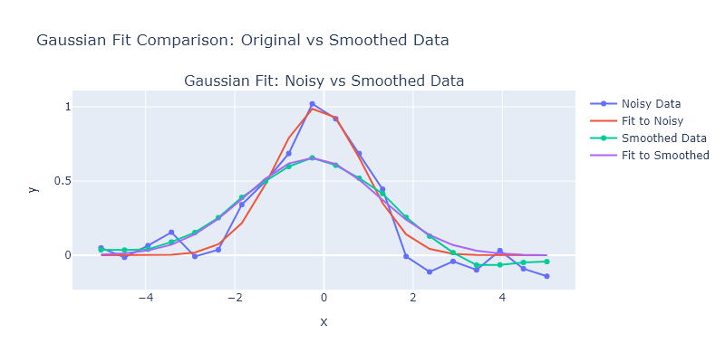
Original (Noisy) Fit Parameters:
 amplitude: 2.4737 ± 0.1602
    center: -0.1142 ± 0.0740
     sigma: 0.9890 ± 0.0740

Smoothed Fit Parameters:
 amplitude: 2.4568 ± 0.0827
    center: -0.2759 ± 0.0580
     sigma: 1.4929 ± 0.0580
_The amplitudes obtained from the fit are quite similar, and this is because they reflect the integrated intensity. _